1 + 2[1] 3MVEN10 Risk Assessment in Environment and Public Health
Calculations, simulations, data analysis and statistical analysis are common elements in risk assessments.
Being able to produce or read code supporting an assessment is a valuable skill when working as an expert or assessor.
Open source systems for coding and reporting are useful for collaborative work, reproducibility and external evaluation.
To learn how to create a presentation in html format using Quarto and how to combine text, figures, equations and results from analysis into a report.
Create a Quarto presentation in html format from R Studio cloud.
Use basic commands in R run from R Studio cloud.
Create a quarto report integrating text and results from running commands i R from R Studio cloud.
25 minutes
No reporting required if present at the exercise
Go to posit.cloud and register an account.
Open a new project and call it “intro”.
Click on the new file button (up to the left) and open a new Quarto Presentation.
Assign a title, e.g. My report
Assign yourself as author
Click on Create
If you get a yellow ribbon asking you to install rmarkdown - Click install and wait. When finished, your window should look like this:
Save the file as “testpresentation.qmd”
Press Render
The program is running the qmd-file creating a html-file that is automatically opened in your browser.
Use the page down button or left/right arrow to change slide.
The code in testpresentation.qmd is currently shown as Visual.
You can enlarge the window by reducing the console window.
Remove all text from line 8 and downwards
Add the following text
## Slide 1

A probability is always between 0 and 1

## Slide 2

Probability can be interpreted as a

- theoretical probability

- frequency

- subjective probability

## Slide 3

Today we have learnt about

### Uncertainty

It was *fun*

### Probability

It was even more **fun**

## Slide 4

Now I practise writing a math expression

$\frac{m}{n}$

$\alpha$

I use two dollar signs to center it

$$X\cdot Y$$If you did not close it before, it should be in the browser.
Now you know how to create a presentation with headings, subheadings and bulletpoints.
R can work as a calculator
You should see the result 3 in the Console
1 + 2[1] 3You can save the result from a calculation as an object
To see the value of y, you have to type it as well in the code an rerun or in the Console
y = 1 + 2
y
[1] 3Now let us look at how to create a plot
It is useful to denote variables with capital letters and use lower case letters for observations of this variable.
For example, x is an sample from X.
x = runif(10)
y = 2*x + rnorm(10)
plot(x,y)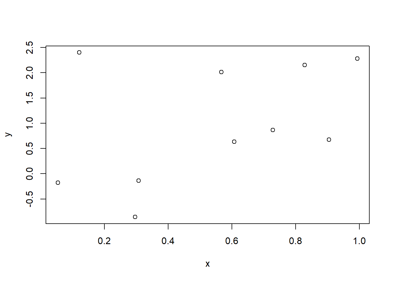
Nice visualisations of data makes a huge difference to a report. We will therefore demonstrate a way to generate the same plot using ggplot2.
This installs several packages including ggplot2 that you will use later on. R-packages are libraries with functions and data sets designed for a specific purpose. Note that you will only have to do this one time in your work space.
library("ggplot2")df = data.frame(x=x,y=y)
ggplot(df,aes(x=x,y=y))+
geom_point()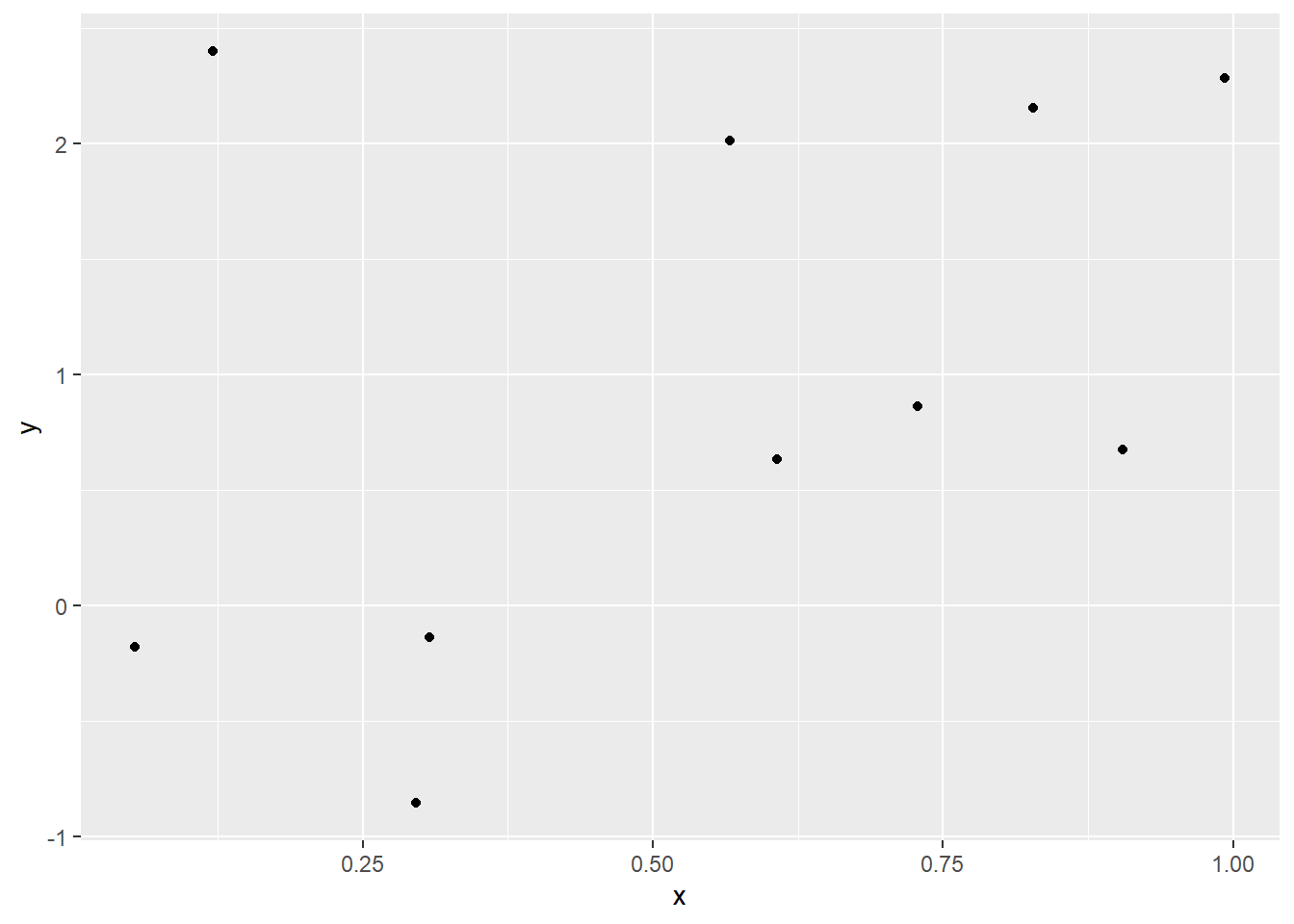
There will be time to explore ggplot later on in the course, but let us add a line fitted to the data.
ggplot(df,aes(x=x,y=y))+
geom_point()+
geom_smooth(method=lm,formula = y ~ x)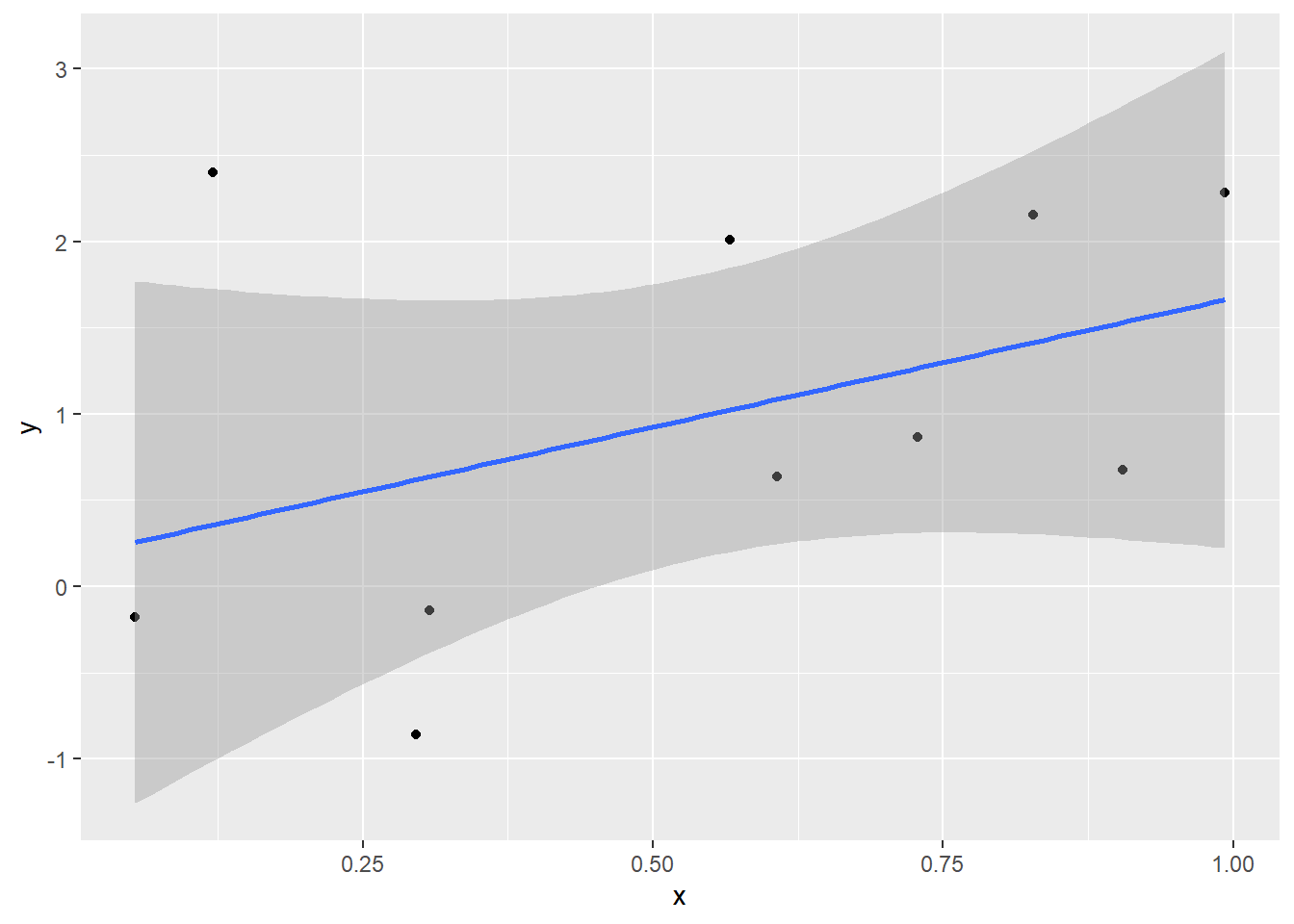
Now you can make a plot using R! More things will be introduced during exercises.
There are lot of resources for self studies on R. We recommend you to have a look at the W3schools’ tutorial on R Statistics after the exercise.
Now you will create a report using Quarto in which you combine text and outputs from code running in R.
Create a new Quarto Document with the title “My Report”, you as the author and save it as “testreport.qmd”
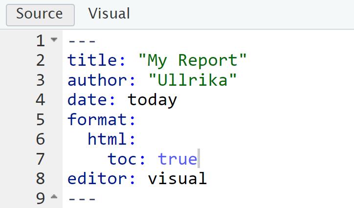
In the configuration section (also known as the YAML), add the text “date: today” as shown in the figure below.
Press Render and view the generated html-file that appears in the browser.
Go back and look at the testreport.qmd file. R-code is added as gray chunks. One can use to show or hide the code.
Let us now add our own information into the report.
Remove everything from line 9 and downwards.
Add the following text
## Summary
### Lessons learnt
Probability can be interpreted as a
- theoretical probability
- frequency
- subjective probability
### Skills gained
(@) Generate presentations and reports using Quarto
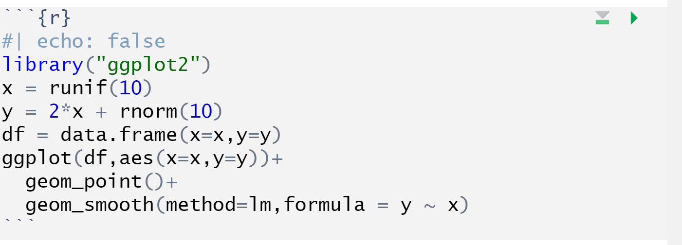
(@) Create and plot data from R, such as thisLet us now add the figure by adding the following code
library("ggplot2")
x = runif(10)
y = 2*x + rnorm(10)
df = data.frame(x=x,y=y)

ggplot(df,aes(x=x,y=y))+
geom_point()+
geom_smooth(method=lm,formula = y ~ x)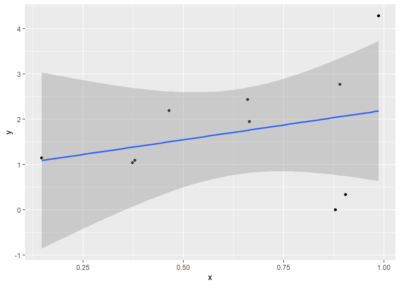
Let us now hide the code by adding #| echo: false in the beginning of the r-chunk
Let us improve the accessibility of the report by adding a table of content.
Isn’t this great!
Let us now end by adding an image to the report
## Risk
*No matter what, it is difficult to save the world without acknowledging that risk involves our values and our uncertainties about the world.*
{width=40%}You can integrate code and create figures in the same way in a Quarto presentation. The only difference is that there is a limitation on every slide.
Begin a new slide by ## [header of the slide]
To simplify sharing code and organise files during the course we here recommend to use folders
data for storing data
ex for storing .rmd files
img for storing images